Sydney Opera House Retail
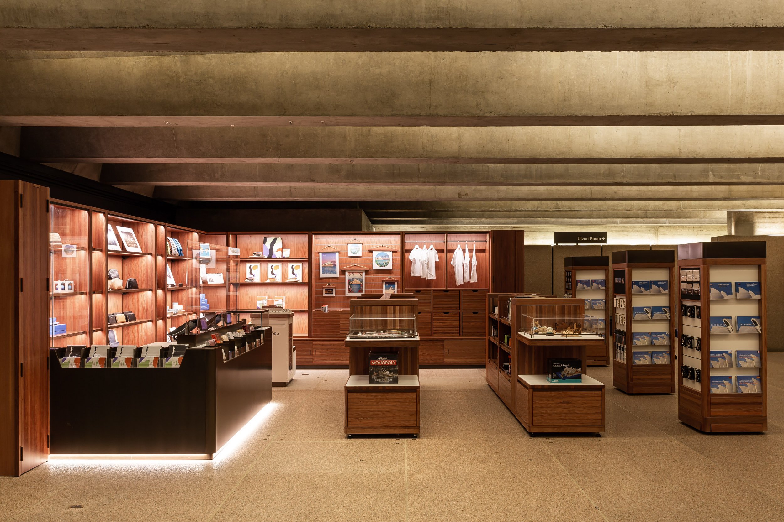
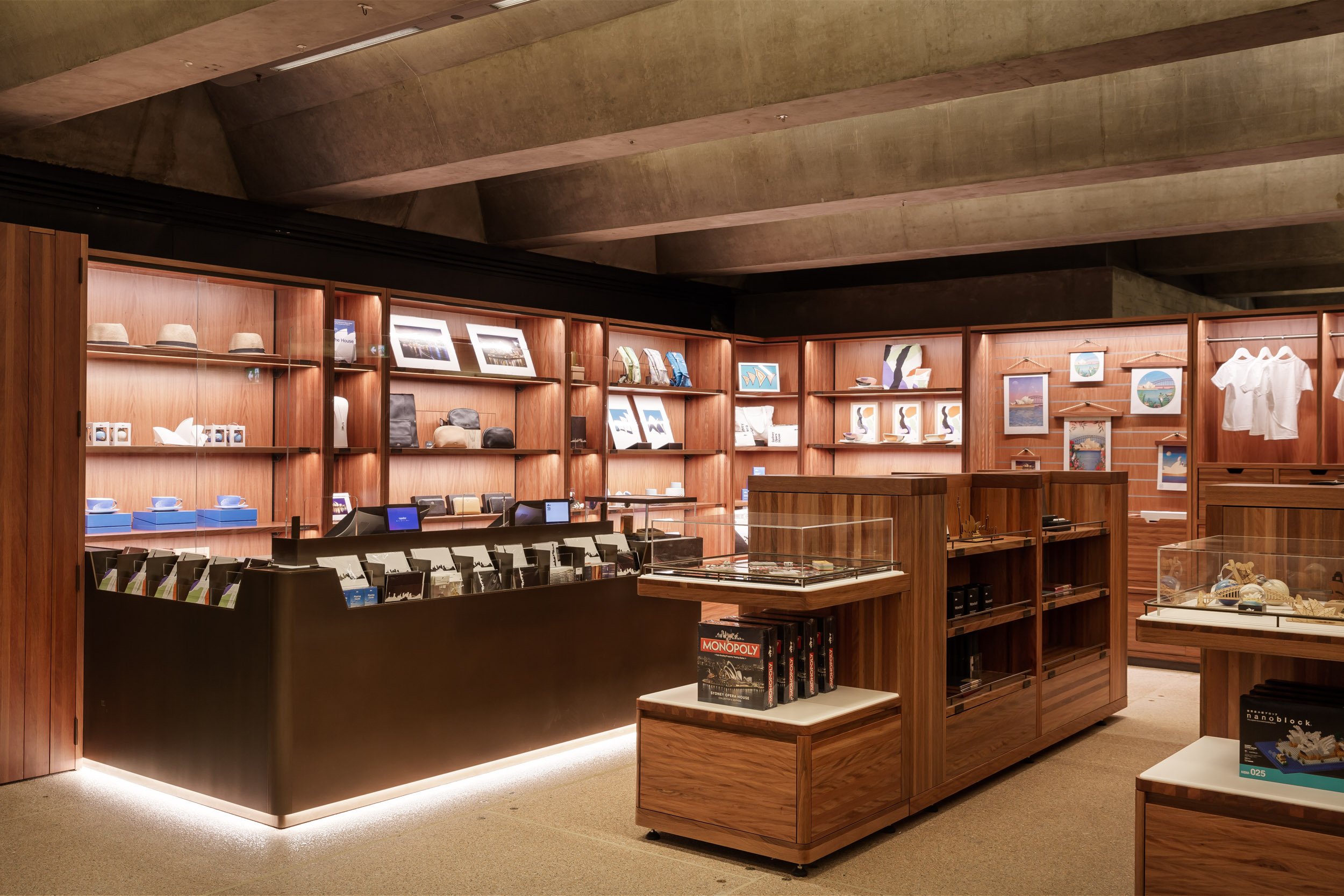
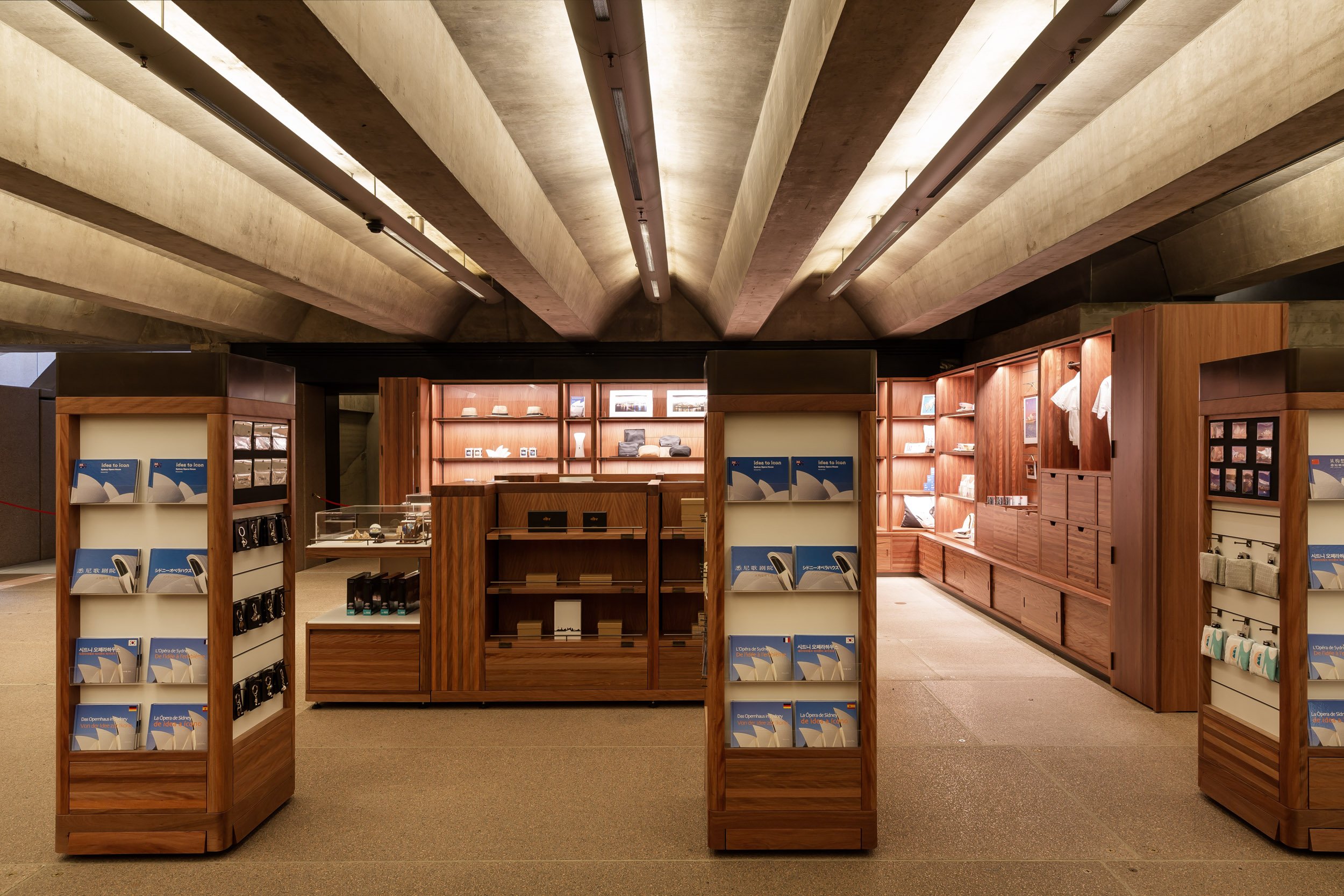
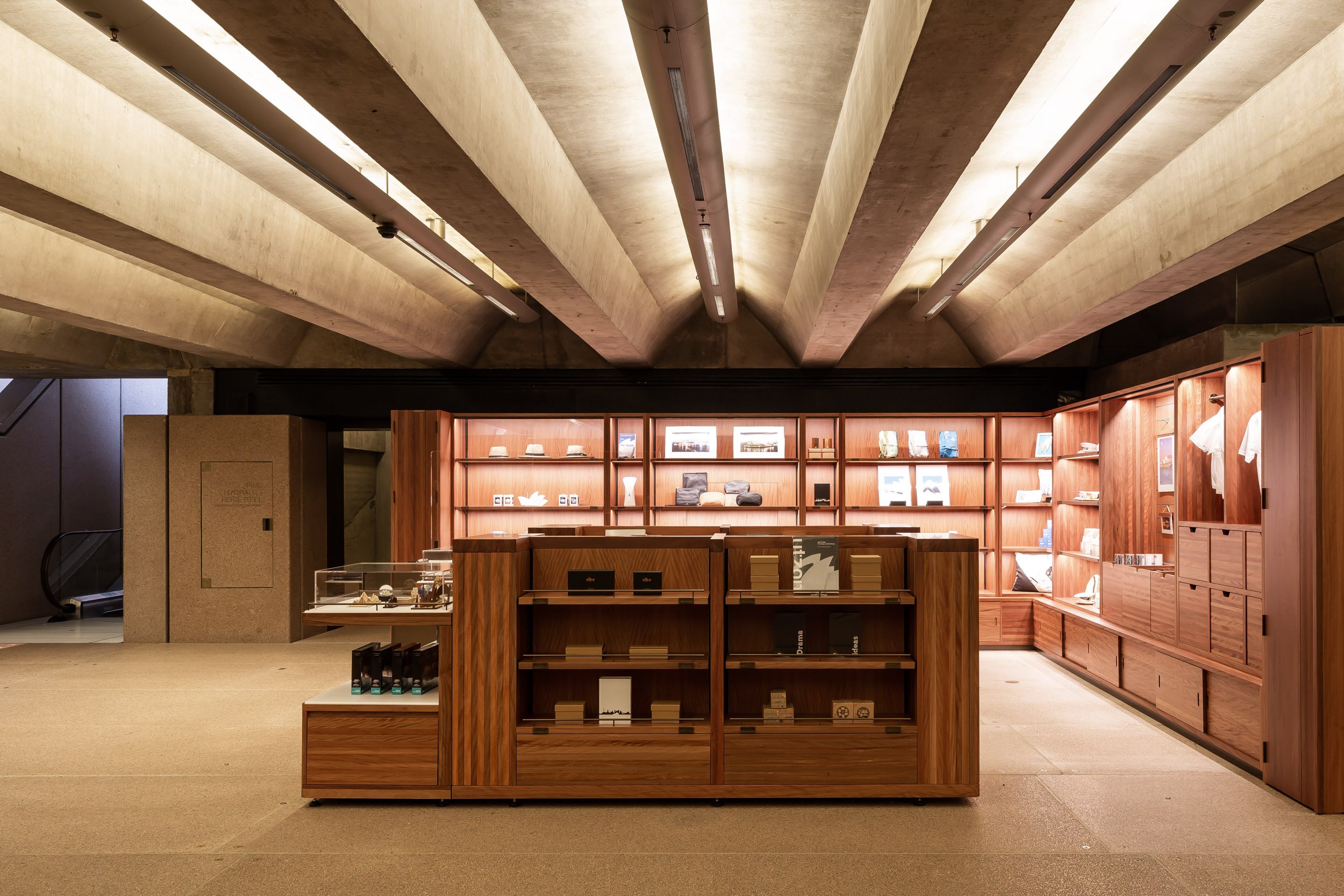
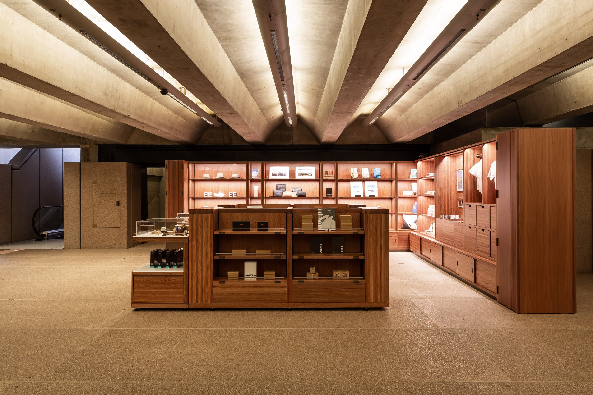
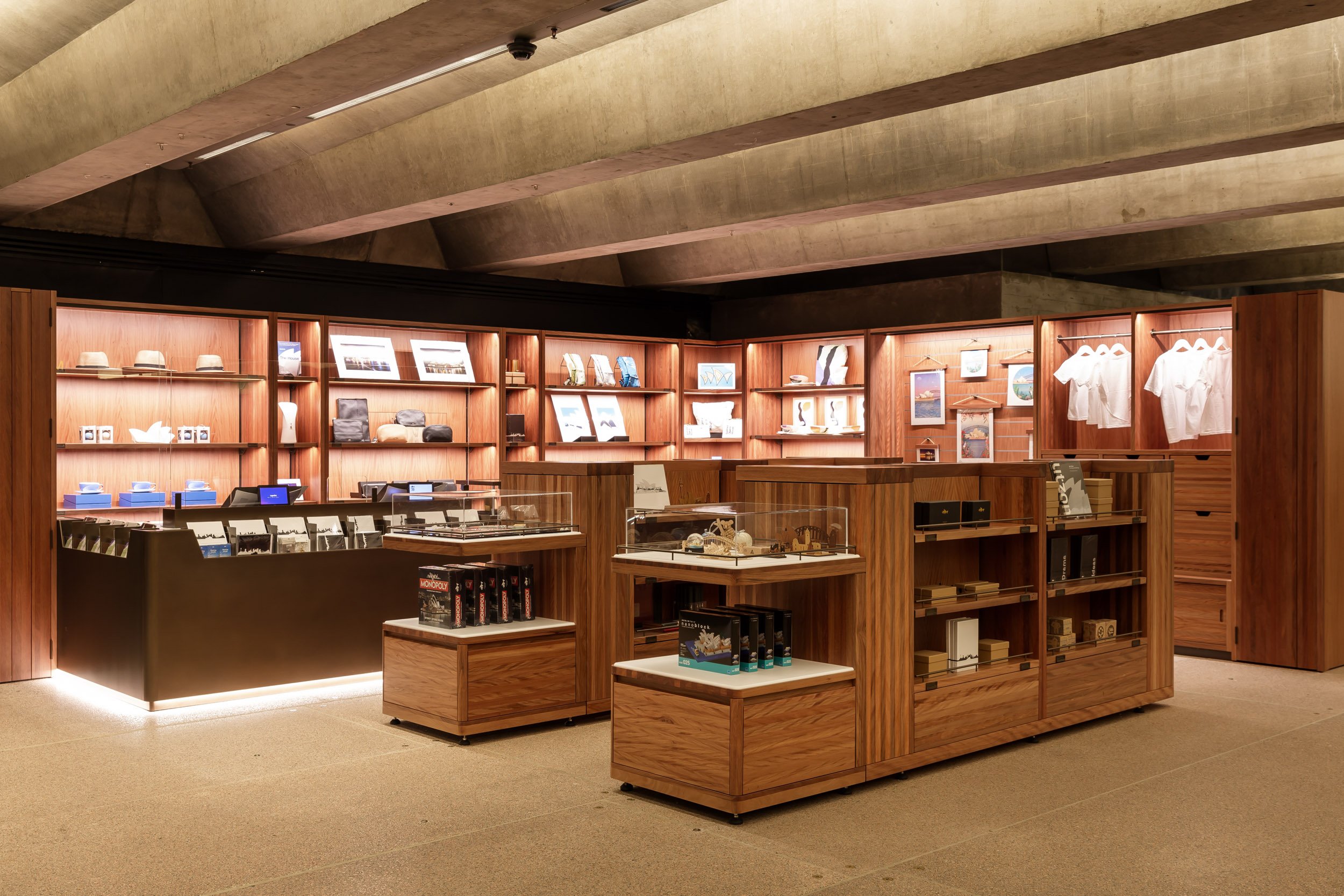
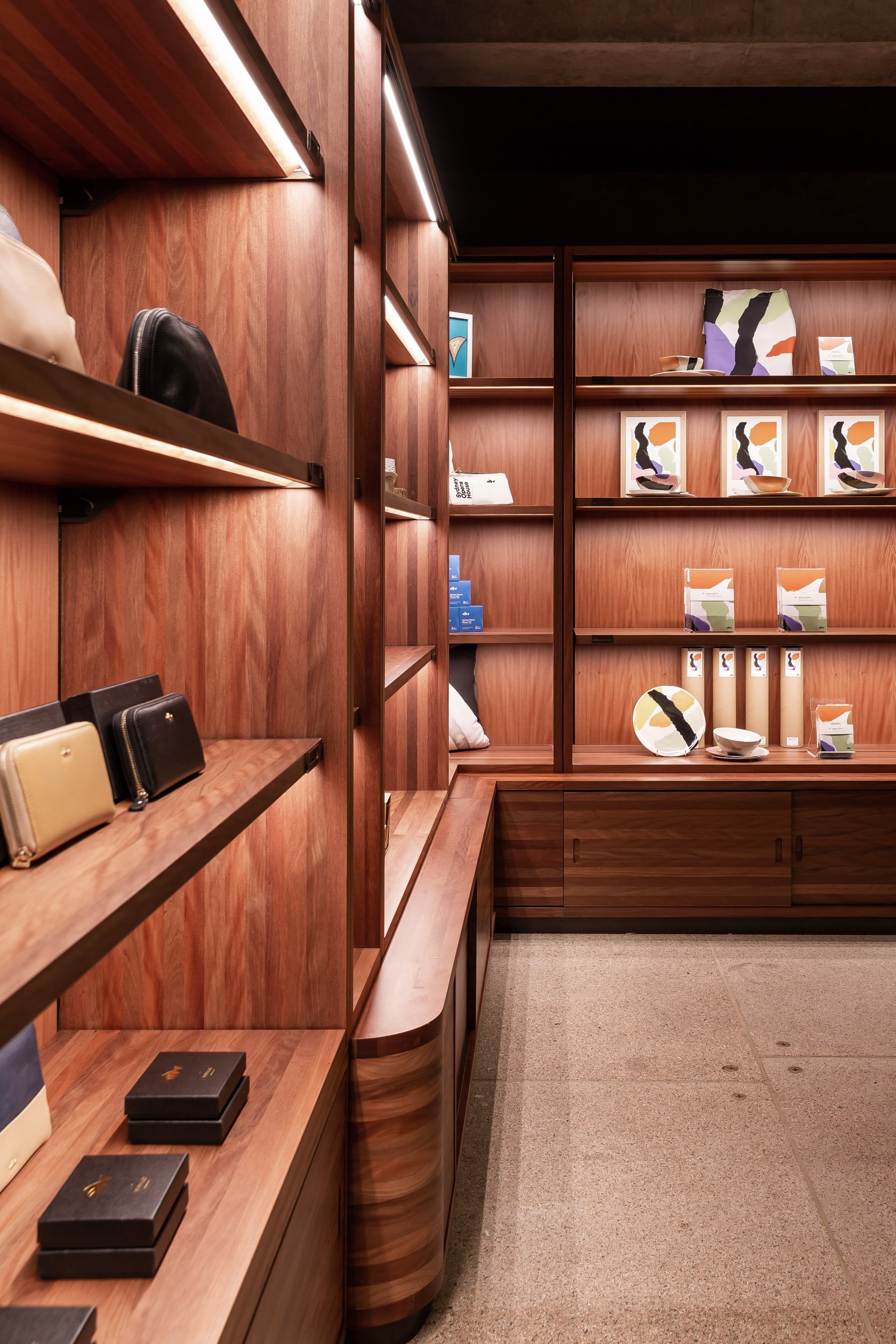
The Sydney Opera House is globally recognised and the task to design the box office retail had to be considerate of the design principles of Jørn Utzon. In response, a clean and simple design language was communicated with a limited palette of materials, to achieve a footprint that was complimentary to the originality of 'The House'.
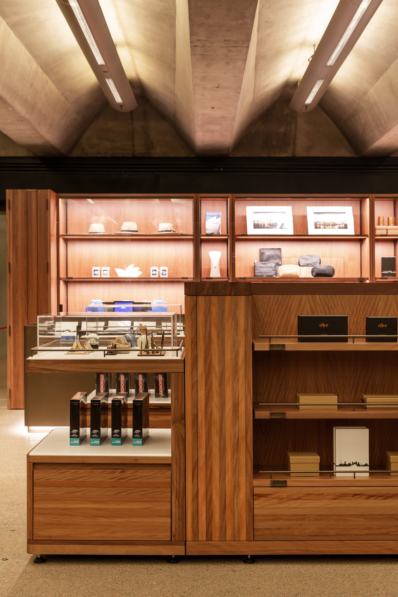
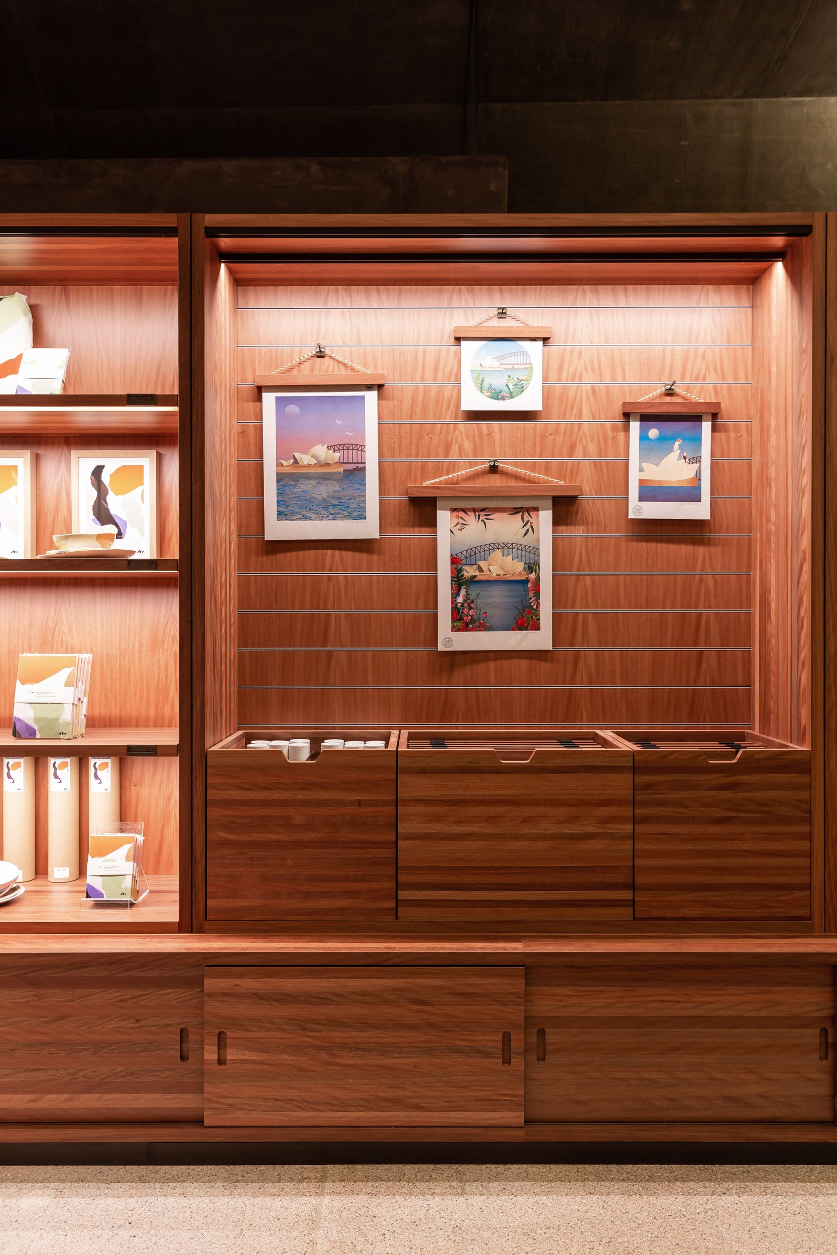
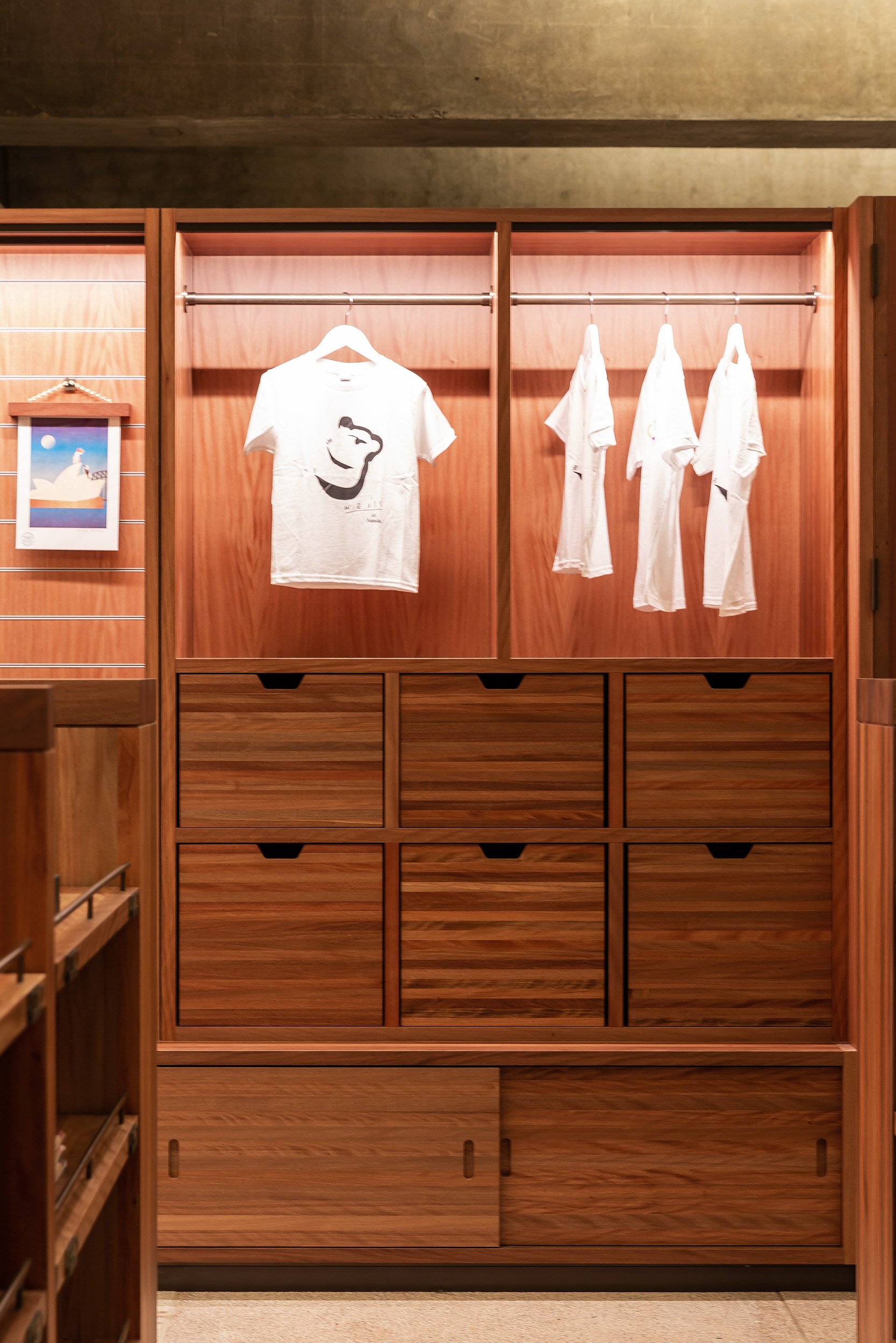
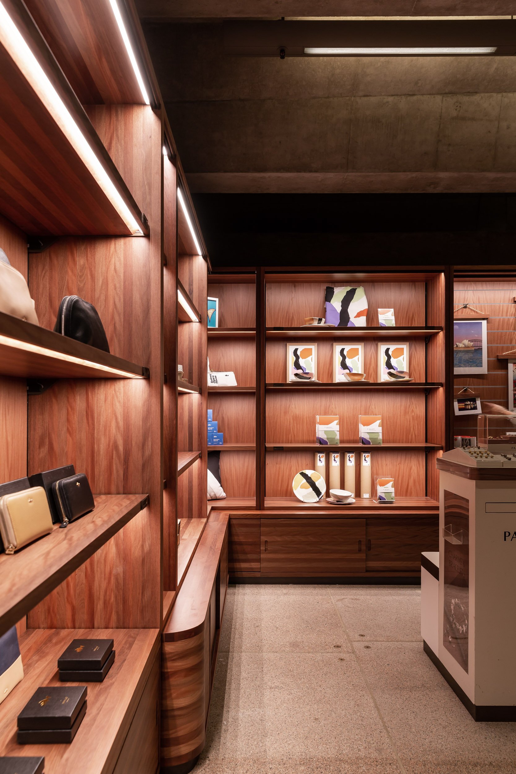
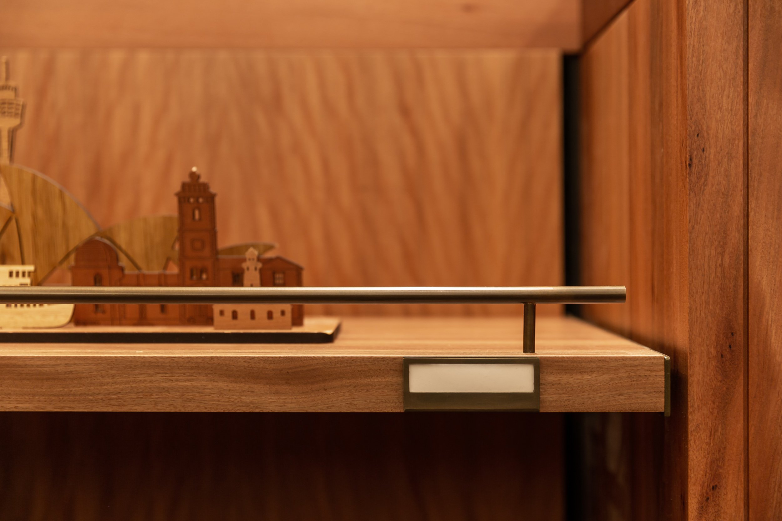
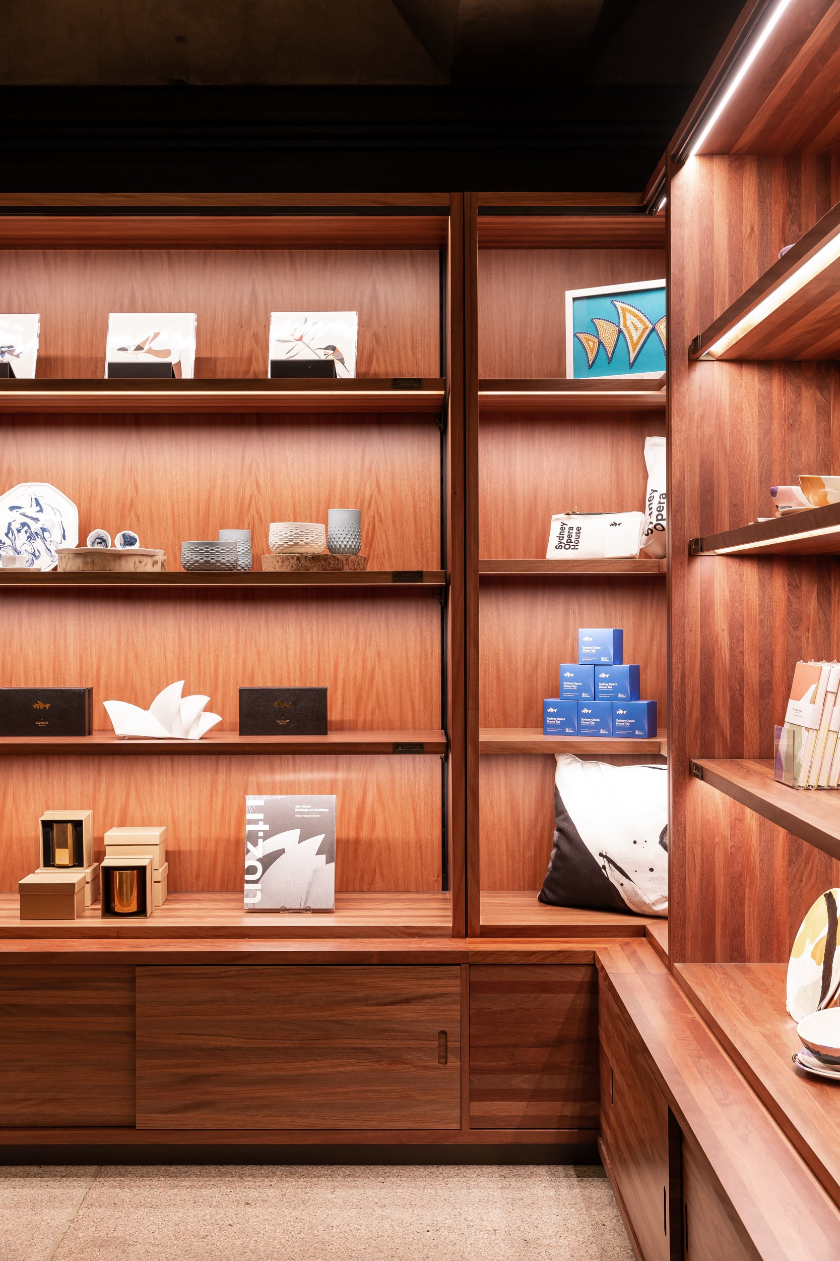
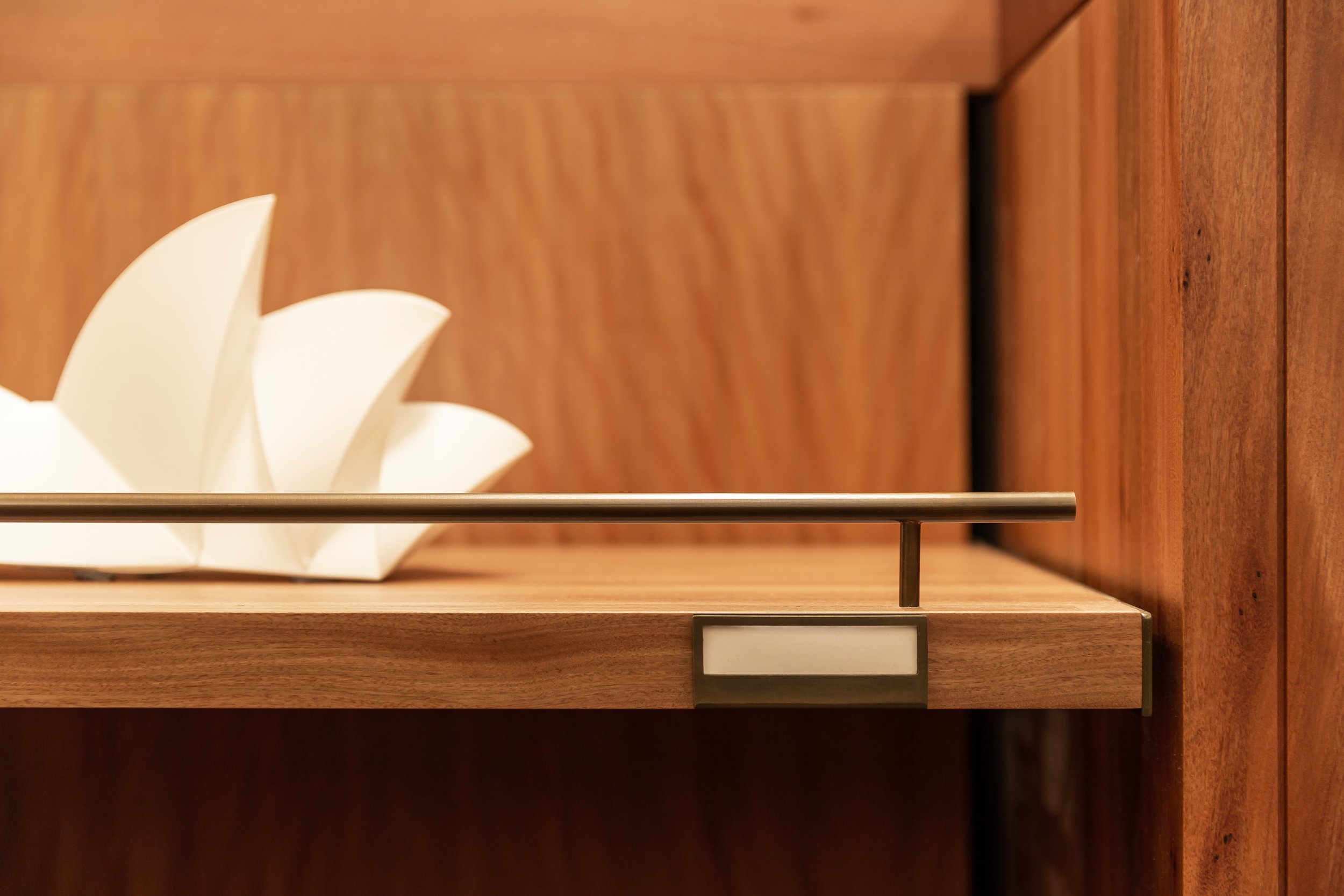
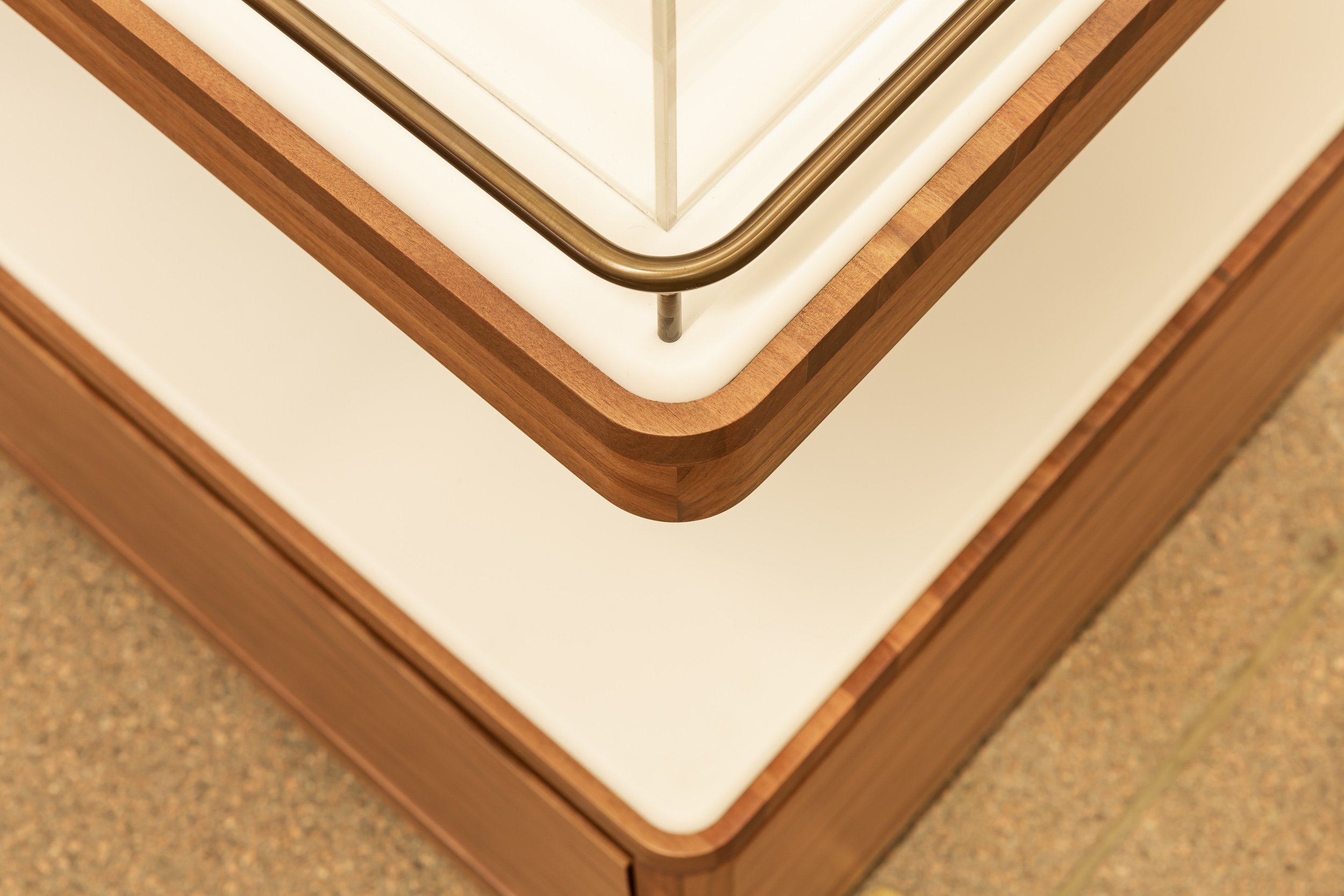
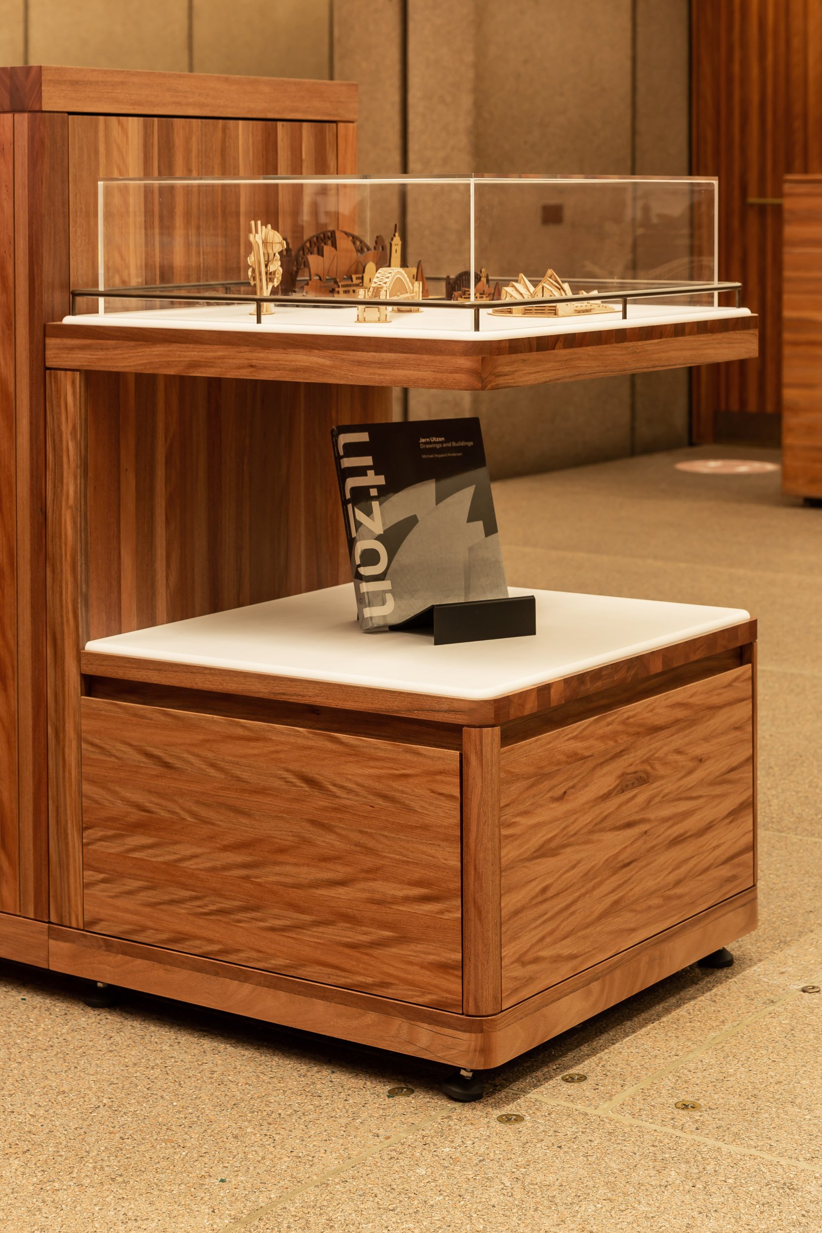
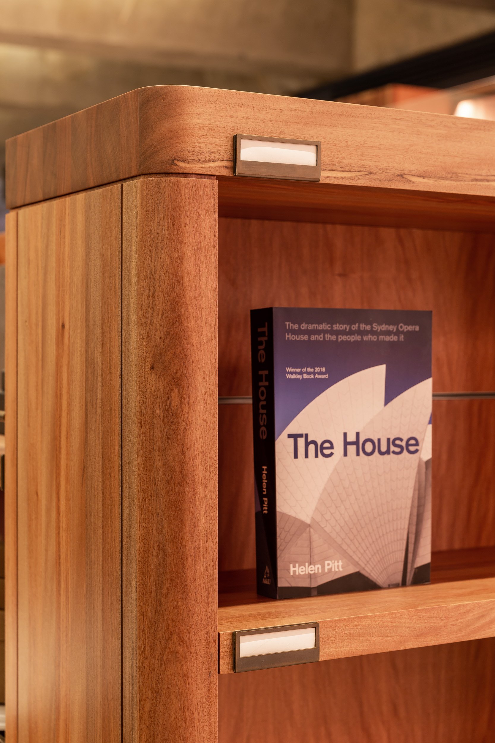
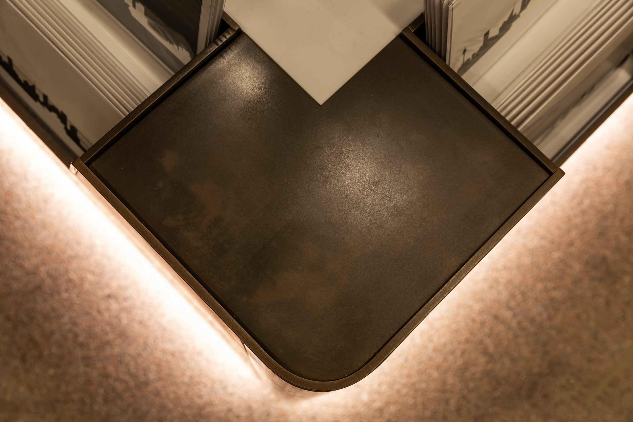
Maintaining the original character of the building was always at the forefront of our design progress, along with maintaining a flexible floor plan. While working with a limited selection of materiality and finishes, it was crucial to not fix any elements to the floor, walls, or ceilings. Freestanding Brush box timber display elements form the retail space with a variety of gondolas, spinner and display tables that optimise patron flow in and out of the store. Carefully selected brass detail and white Corian lift the design and highlight feature displays.

